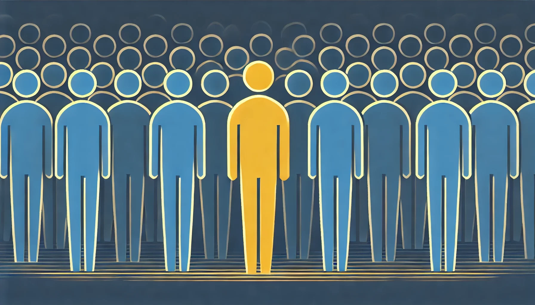
First Impressions Matter: How Users Form Opinions in Seconds
When someone lands on your website, the clock starts ticking. In just a few seconds, they decide whether to stay or leave. That first impression can make or break your chances of turning visitors into loyal customers. But what exactly influences that snap judgment? Let’s dive into the psychology of first impressions and how you can ensure your website captures attention instantly.
The Blink Effect – Why First Impressions Happen So Fast
Have you ever met someone and instantly formed an opinion about them? The same thing happens with websites. Your visitors don’t need minutes to evaluate your brand—they do it in the blink of an eye. Research suggests that it takes just 50 milliseconds (that’s 0.05 seconds!) for users to form an impression about your website. That’s faster than it takes to blink!
Why does this happen? Our brains are wired to process visual information at lightning speed. When we see something new, we instinctively scan for signs of trust, clarity, and relevance. If something feels off—like cluttered design, slow loading time, or confusing navigation—users won’t think twice before clicking away.
Your takeaway? The first thing your audience sees should be visually appealing, easy to understand, and instantly reassuring.
Design, Colors & Visual Appeal – The Silent Storytellers
Imagine walking into a store where everything is messy, the lighting is dull, and the shelves are half-empty. Would you want to stay? Probably not. Your website works the same way! The visual appeal of your site is the first thing visitors notice, and it speaks volumes about your brand before they even read a single word.
Here’s what makes an immediate impact:
- Colors that evoke emotions – Blue builds trust, red sparks urgency, and yellow radiates energy.
- Typography that’s easy to read – No one likes squinting at tiny, fancy fonts.
- Whitespace that brings clarity – Clutter confuses visitors, but breathing room keeps things digestible.
- Consistent branding – A website that matches your brand identity builds trust instantly.
Great design isn’t just about looking good; it’s about creating a smooth experience that guides users naturally. A polished, well-structured layout signals professionalism, while a chaotic design screams, “Run away!”
Speed & Simplicity – The Secret Weapons of Retaining Users
If your website takes forever to load, users won’t stick around—no matter how beautiful it looks. Studies show that 53% of mobile users leave a site if it takes longer than 3 seconds to load. In today’s fast-paced world, patience is rare, and competition is fierce.
The fix? Speed up your website. Compress images, minimize unnecessary scripts, and use fast-loading hosting. You don’t need flashy animations if they slow things down—simplicity often wins.
Speaking of simplicity, don’t overwhelm users with too much information at once. Clear menus, easy-to-find buttons, and a straightforward layout help visitors navigate smoothly. If they have to “figure out” how to use your website, they’ll probably leave before they do!
Building Instant Trust – What Makes Users Stay?
People won’t do business with you if they don’t trust you. First impressions don’t just influence how users feel about your design but also how credible they think you are. So, how do you establish trust in those first crucial moments?
Here’s what helps:
✔ A professional logo and branding – Make sure your brand identity looks polished and not thrown together last minute.
✔ Clear messaging – Tell visitors what you do immediately. Avoid vague statements—be direct and compelling.
✔ Fast-loading, responsive design – A mobile-friendly site shows professionalism and care for user experience.
✔ Visible social proof – Testimonials, awards, client logos, and positive reviews boost credibility instantly.
✔ Secure browsing experience – HTTPS encryption reassures users that their data is safe with you.
Think about it—if you land on a website that looks outdated, has broken links, or lacks basic contact details, would you trust it? Probably not. Your visitors feel the same way!
The Science of Color & Typography – How Design Influences Trust

First Impressions Start with Color
Have you ever landed on a website and instantly felt comfortable—or, on the flip side, completely turned off? That’s the power of color at work. Colors speak to our emotions before we even process words or layouts. Blue builds trust, which is why so many financial and healthcare brands use it. Red sparks urgency, making it a favorite for sales and limited-time offers. And green? Well, it often signals growth and sustainability, giving brands a fresh, natural feel. You might not consciously think about these choices, but your brain is making snap judgments based on color alone.
Typography: More Than Just Pretty Fonts
Fonts don’t just carry words—they carry personality. Imagine visiting a law firm’s website only to see playful bubble letters. Would you trust them to handle your case? Probably not. Typography shapes how we perceive brands. Serif fonts, like Times New Roman, bring a classic, reliable feel, while sans-serif fonts, like Helvetica, feel modern and clean. Handwritten or script fonts? They can add a personal touch but should be used sparingly to avoid making things difficult to read. Good typography balances style and function, guiding users effortlessly through content while reinforcing trust.
The Perfect Marriage of Color & Typography
The most effective websites combine color and typography seamlessly to create a brand identity that users trust. Think about high-end fashion brands—black and white with sleek, elegant fonts scream sophistication. Meanwhile, children’s brands use bright colors and playful fonts to create a sense of fun. Consistency is key. A mismatched combination can leave users feeling confused, while a harmonious blend builds credibility, keeps visitors engaged, and subtly guides them toward conversion.
Navigation That Works – Why Simplicity Leads to Better UX
The Beauty of Simple Navigation
Ever visited a website and felt instantly lost? That’s the problem with bad navigation—it confuses users and makes them leave. A clean, simple navigation system helps users find what they need quickly, making their experience smooth and frustration-free. Think about it: when was the last time you enjoyed digging through five confusing menus just to find a contact page? Exactly.
The Psychology Behind Simple Navigation
Your brain craves order. Studies show that when a website has a cluttered menu with too many choices, users feel overwhelmed. This is called the paradox of choice—the more options you give people, the harder it is for them to decide. Keeping navigation simple reduces mental effort, allowing users to move through your site effortlessly and take the actions you want them to take.
Key Elements of an Effective Navigation System
So, what makes great website navigation? First, a clear and concise menu. Users should instantly understand what each menu item means. Second, predictable placement—users expect menus at the top or left side of a page. Third, a search bar—because sometimes, people just want to type and find what they need instantly. These small tweaks make a big difference in keeping visitors engaged.
How Simple Navigation Boosts Conversions
A website with great navigation doesn’t just look good—it converts better. When users can easily find information, they are more likely to sign up, buy a product, or contact you. Simple navigation builds trust and keeps users on your site longer. In digital marketing, every second counts, and a complicated menu is just another reason for visitors to click away. Keep it simple, and you’ll see the results!
Simplicity isn’t boring—it’s powerful. The best websites in the world follow this principle, and yours should too!
Final Thoughts
A high-converting website isn’t just about aesthetics—it’s about understanding human psychology, user expectations, and behavior. First impressions shape a visitor’s perception in just milliseconds, determining whether they stay or bounce. The right combination of color and typography builds trust and subtly influences emotions, while fast loading speeds and intuitive navigation ensure users don’t get frustrated. A clean, clutter-free layout makes actions clearer, and mobile optimization ensures you’re not turning away half your potential audience.
But beyond usability, emotional connection is what truly turns visitors into loyal customers. When a website feels personal, relatable, and effortless to use, users don’t just browse—they connect, trust, and return. Studies show that 88% of online consumers are less likely to return to a website after a bad experience. On the flip side, a smooth, well-structured experience keeps people engaged, encourages conversions, and boosts long-term brand loyalty.
In a world where digital competition is fierce, your website is your biggest asset. Investing in great UX/UI isn’t just about design—it’s about building a seamless journey that leads users exactly where you want them to go. Whether you’re looking to increase sales, grow your audience, or build trust, prioritizing user experience is the key to long-term success.
So, is your website helping or hurting your business? Now is the time to optimize, simplify, and convert!